Aim high and you will strike high

Aim high and you will strike high

Friday, 3 September 2010

Week 6 last blog for semester 2-Barbara Kruger


American conceptual/pop artist Barbara Kruger is internationally renowned for her signature black, white and red poster-style works of art that convey in-your-face messages on women's rights and issues of power. Coming out of the magazine publishing industry, Kruger knows precisely how to capture the viewer's attention with her bold and witty photomurals displayed on billboards, bus stops and public transportation as well as in major museums and galleries wordwide. She has edited books on cultural theory, including Remaking History for the Dia Foundation, and has published articles in the New York Times, Artforum, and other periodicals. Monographs on her work include Love for Sale, We Won't Play Nature to Your Culture and others. She is represented in New York by Mary Boone Gallery. A major exhibition of her work will be presented at the Museum of Contemporary Art in Los Angeles in fall 1999, and at the Whitney Museum in New York in 2000.

Research Kruger's work to find an example from the 1970s or 1980s to compare with a more recent work. How has Kruger's work changed with the developments in contemporary visual arts? Describe a recent work that moves away from the 'poster' type work of her early career.


Barbara Kruger(1945-)is representative feminist artist in the modern time. she make a strong stand about an organization of male domination by unusual expression which was combination with picture and text. Her fist artistic purpose is resistance about institutional power in social life. Her strategy received to 70s art, particularly, she was influenced by conceptual artists and her works be based on post-modernism.

(http://www.lmsphoto.com/wanee/bbs/board.php?bo_table=7_1&wr_id=27)

(1970-1980)


How does the audience experience a more spatial, installation art work compared with a poster?
What elements does Kruger use in her work to create a strong impact?


[untitled (between being born and dying), 2008]
It is recent work in her works for Moderna Museet’s 50th anniversary in 2008.
It was installed in museum by posters. she used images which was taken by her and text. The expression which was mixed photos and words or sentences usually shows black and white photos and the red and white texts. This work is poster style but it looks like interior or installation art in the museum as well. I think this work was made more develop by her than existing other works.


I think spatial art and installation are 3D works which show three-dimensional structure but 2D works such as visual art and graphic art like poster which show flat structure. When 3D artist make works, they always use materials which can be solid things so viewers feel various things in one space. On the other hand her work looks like 3D but her material or her expression ways is 2D. She made by both 2D and 3D so audience experience is more spatial than existing other 2D and 3D works.

Week 5 - Kehinde Wiley


Kahinde Wiley is a Gay American based painter born in Los Angeles, who has an international reputation living between Pe King and Brooklyn.


Last weeks ALVC class focused on the Post Modern them "INTERTEXTUALITY", re-read Extract 1 The death of the author on page 44 of your ALVC books and respond to the oil paintings of Kehinde Wiley. How do we make sense of his Kehinde's work? Identify intertextuality in Kehinde's work?

I read books and I got more information about INTERTEXTUALITY.
It refers to connection of contexts. Roland Barthes or Julia Cristeva said that if we read one text in one's name when we read about that, we can't read and we can't understand. we can understand or interpret stories by thinking More two texts connection. INTERTEXTUALITY can make expectation of story when we read a book.

Derived from the Latin intertexto, meaning to intermingle while weaving, intertextuality is a term first introduced by French semiotician Julia Kristeva in the late sixties. In essays such as "Word, Dialogue, and Novel," Kristeva broke with traditional notions of the author's "influences" and the text's "sources," positing that all signifying systems, from table settings to poems, are constituted by the manner in which they transform earlier signifying systems. A literary work, then, is not simply the product of a single author, but of its relationship to other texts and to the strucutures of language itself. "[A]ny text," she argues, "is constructed of a mosaic of quotations; any text is the absorption and transformation of another" (66).
Intertextuality is, thus, a way of accounting for the role of literary and extra-literary materials without recourse to traditional notions of authorship. It subverts the concept of the text as self-sufficient, hermetic totality, foregrounding, in its stead, the fact that all literary production takes place in the presence of other texts; they are, in effect, palimpsests. For Roland Barthes, who proclaimed the death of the author, it is the fact of intertexuality that allows the text to come into being: Any text is a new tissue of past citations. Bits of code, formulae, rhythmic models, fragments of social languages, etc., pass into the text and are redistributed within it, for there is always language before and around the text. Intertextuality, the condition of any text whatsoever, cannot, of course, be reduced to a problem of sources or influences; the intertext is a general field of anonymous formulae whose origin can scarcely ever be located; of unconscious or automatic quotations, given without quotation marks. ("Theory of the Text" 39).
Thus writing is always an iteration which is also a re-iteration, a re-writing which foregrounds the trace of the various texts it both knowingly and unknowingly places and dis-places.
Intertexts need not be simply "literary"--historical and social determinants are themselves signifying practices which transform and inflect literary practices. (Consider, for example, the influence of the capitalist mode of production upon the rise of the novel.) Moreover, a text is constituted, strictly speaking, only in the moment of its reading. Thus the reader's own previous readings, experiences and position within the cultural formation also form crucial intertexts.
The concept of intertexuality thus dramatically blurs the outlines of the book, dispersing its image of totality into an unbounded, illimitable tissue of connections and associations, paraphrases and fragments, texts and con-texts. For many hypertext authors and theorists, intertextuality provides an apt description of the kind of textual space which they, like the figures in Remedio Varo's famous "Bordando el Manto Terrestre," find themselves weaving:a kind of tapestry which spilled out the slit windows and into a void, seeking hopelessly to fill the void: for all the other buildings and creatures, all the waves, ships, and forests of the earth were contained in this tapestry, and the tapestry was the world. (Pynchon 10)
(http://www2.iath.virginia.edu/elab//hfl0278.html)

Kehinde Wiley’s works reference specific paintings by Titian and Tiepolo, but he incorporates a range of art historical and vernacular styles in his paintings, from the French Rococo to the contemporary urban street. Wiley collapses history and style into a uniquely contemporary vision. He describes his approach as “interrogating the notion of the master painter, at once critical and complicit.” He makes figurative paintings that “quote historical sources and position young black men within that field of ‘power.’” His “slightly heroic” figures, slightly larger than life size, are depicted in poses of power and spiritual awakening. He deliberately mixes images of power and spirituality, using them as a filter in the portrayal of masculinity. Kehinde Wiley’s exhibition Infinite Mobility recently appeared at the Brooklyn Museum in New York.
(http://www.deitch.com/artists/sub.php?artistId=11)


Kehinde's work relates to this weeks Post Modern theme "PLURALISM" re-read page 50 and discuss how the work relates to this theme?


Wiley recreates history by inserting African Americans into the canon of art history, and in doing so expands our knowledge of how race has been expressed in it. Paul D. Miller, also known as D.J. Spooky states, “Wiley’s canvas surfaces are a mirror reflection of America’s unceasing search for new meanings from the ruins of the Old World of Europe and Africa. In the process of reflection, the world that we see on his canvas transforms the way we think about old and new, race, masculinity, and above all, the generous soul of an artist’s ability to provide a way of saying simply: another world is possible.” (11)
The paintings baldly appropriate portraiture from the past, and juxtapose this appropriation with embodiments of an American culture that is usually represented by images that inspire fear, danger, and anger. The portraits are political, but contain humor and empathy at the same time. Wiley appropriates images from old world Western realism, and recently from political posters, and juxtaposes them with ornamentation, pattern, and hip hop fashion, a process DJ Spooky describes as “Sample: Cut, Paste, Repeat.” (11)
Wiley’s initial artistic project was simple, and elegantly defiant. He asked young African American males to model for him in his studio. He then had them look through art history books and assume poses from historical portraiture. He would then photograph them and paint their portraits as those icons of art history. Black American youth replaced European princes and kings, and African Americans became retroactive subjects for iconic historical paintings. (11)
Since those early works, Wiley’s portraiture has expanded to include celebrities, models posed as figures in Communist Chinese propaganda posters, and work based on African sculpture. In his most recent show at Deitch projects entitled “Down”, Wiley confronted issues of violence and oppression in African American male culture. This then; the rewriting of history, a reconsideration of race, and the formal chops to do it in the form of these dazzling portraits.
kehinde-wiley-acting-in-accordance-with-chairman-maos-instructions-means-victory-2007-oil-on-canvas-6-x-5-feet
Wiley’s paintings are exercises in dense color and ornamentation. We see rococo swirls and fleur de lis flash and pop like abstract flames around the figures. Often they are patterns from African or Middle Eastern Ornamentation. (12) Wiley gives his sitters the decorative settings worthy of the halls of kings. And though Wiley’s paintings are heavily devoted to the Old Masters in iconography, they also feel very contemporary because of how they are built. Wiley uses photographic reference and digital manipulation that he does not try to diminish. His paint handling is smooth and brushless, and the edges and surfaces around the figures are hard and unnatural. This adds a formal level of complexity to the paintings, as his methods add another juxtaposition between art history and contemporary image making. The paintings ultimately transform into what Wiley calls a “Third Object” (12), – neither historical nor contemporary, but a sample of both that becomes wholly new in Wiley’s paintings.
Kehinde's work raises questions around social/cultural hierarchies , colonisation, globalisation, stereotypes and the politics which govern a western worldview.
Information on specific paintings was difficult to obtain however Matt has the info for the last 2 paintings.
(http://portraitsocietygallery.wordpress.com/essays-about-portraiture/)


Renaissance master
1.) K.W.’s art replicates important historical figures and shows young, urban, black men with power. These images show how he used an old renaissance painting, but changed it to a new, unique, and contemporary way. Wiley’s work is different and a fresh change. The complimentry colors he uses work really well together. It is easy to understand and has a good message.)
(http://megsny.wordpress.com/2008/04/)

Week 4- Anish Kapoor


Celebrated for his gigantic, stainless steel 'Cloud Gate' sculpture in Chicago’s Millennium Park, Anish Kapoor is changing the cultural environment with his public works.


1.Research Kapoor's work in order to discuss the ideas behind 3 quite different works from countries outside New Zealand.


1. Memory (2008) 2. Cloud Gate (2004) 3. Yellow (1999)

2.Discuss the large scale site specific work that has been installed on a private site in New Zealand.

"The farm" is an installation and It sustains wind and wind and communication whith viewers through it. It is Kapoor’s recent installation and his first sculpture in outside. It looks like a trumpet and red long shape.


3. Where is the Kapoor's work in New Zealand? What are its form and materials? What are the ideas behind the work?

"The farm" was installed in Kaipara Bay north of Auckland. The work was made with red PVC-coated polyester fabric and steel ellipses in collaboration. It is so big, so wide landscape can be art space and so beautiful area and if viewers are at inside of the work, they can have various sight.
I think It was made as purpose that it can give the beautiful landscape to viewers through the work with withstand wind.


4. Comment on which work by Kapoor is your favourite, and why.


"Cloud Gate on the AT&T Plaza"

Cloud Gate is British artist Anish Kapoor's first public outdoor work installed in the United States. The 110-ton elliptical sculpture is forged of a seamless series of highly polished stainless steel plates, which reflect the city's famous skyline and the clouds above. A 12-foot-high arch provides a "gate" to the concave chamber beneath the sculpture, inviting visitors to touch its mirror-like surface and see their image reflected back from a variety of perspectives.
Inspired by liquid mercury, the sculpture is among the largest of its kind in the world, measuring 66-feet long by 33-feet high. Cloud Gate sits upon the At&T Plaza, which was made possible by a gift from AT&T.
What I wanted to do in Millennium Park is make something that would engage the Chicago skyline…so that one will see the clouds kind of floating in, with those very tall buildings reflected in the work. And then, since it is in the form of a gate, the participant, the viewer, will be able to enter into this very deep chamber that does, in a way, the same thing to one's reflection as the exterior of the piece is doing to the reflection of the city around.
-Anish Kapoor
(http://www.millenniumpark.org/artandarchitecture/cloud_gate.html)

I really like this work because my major is interior and architecture design in korea. so I am interested about installation. When i saw his work at first time, I shouted because I was amazing and I Really like huge special design and his work can reflect of sky and buildings so it is beautiful things to me, of course I am sure that many people which visit his work's area. so it is my favorite work of Anish Kapoor and I wanna visit to Millennium Park I really hope that !!!!

Youtube has some excellent footage on Kapoor-take a look at Anish Kapoor at the Royal Academy!!

Thursday, 2 September 2010

Week 2 - Hussein Chalayan

Hussein Chalayan is an artist and designer, working in film, dress and installation art. Research Chalayan’s work, and then consider these questions in some thoughtful reflective writing.

1. Chalayan’s works in clothing, like Afterwords (2000) andBurka (1996) , are often challenging to both the viewer and the wearer. What are your personal responses to these works? Are Afterwords and Burka fashion, or are they art? What is the difference?

Not all clothing is fashion, so what makes fashion fashion?


When I saw his Afterwords at first time, I was really interested that it can use both the cloth and table. Afterwords which is table skirt, is very very fun and unconventional thing. Moreover, I was surprised about his Burka because it can be bic issue in the world. He changed Burka which is religion of a country, strong belief and ceremony resolutely as fashion.
I think afterwords can look fashion because Chalayan made the skirt and we could see it which was worn by model on runway but Burka it isn't fashion I think. it is just expression of belief or rule like law. People who don't live Iran or don't have same nationality, can't understand Burka and it can't be fashion to them. I think Burka disturbs our expression of fashion and individual freedom, instead.


2. Chalayan has strong links to industry. Pieces like The Level Tunnel (2006) and Repose (2006) are made in collaboration with, and paid for by, commercial business; in these cases, a vodka company and a crystal manufacturer. How does this impact on the nature of Chalayan’s work? Does the meaning of art change when it is used to sell products? Is it still art?


‘The Level Tunnel‘ is a project for Level Vodka, designed by Hussein Chalayan. The tunnel a 15 meter long, 5 meter high, glass installation that captures the essence of Level Vodka. Visitors can walk through the tunnel blindfolded or experience it from outside. Chalayan used sound, scent and touch to create something unique. The sound for example, is created by a flute made from a vodka bottle. And when a visitor is going through the tunnel, his position is tracked and he can smell the scent of lemon and cedar as he goes further into the tunnel. When the visitor leaves the tunnel, he can of course taste the vodka. All these senses together should give the visitor an impression of what Level Vodka stands for. It is currently on display in Mexico City but it will travel to Paris and Athens later this year.
(http://www.todayandtomorrow.net/page/202/)


Hussein Chalayan created an airplane wing balancing against a wall. When its large wing flap moves, a long strip of Swarovski crystals are illuminated by LEDs. — Photo courtesy of Swarovski
Hussein Chalayan, an internationally regarded designer celebrated for his progressive attitude to new technology created Repose, a conceptual art installation piece. Repose shows an airplane wing balanced against a wall; its large wing flap moves up and down to reveal a long strip of crystals illuminated by LEDs.
(http://www.digitaljournal.com/article/36556)

I think his works are still art. Even though his works used as business purpose, when people see his works if they feel good or fun it can be art. Moreover if he considered about some essential elements esthetically, his works can be still art.


3. Chalayan’s film Absent Presence screened at the 2005 Venice Biennale. It features the process of caring for worn clothes, and retrieving and analysing the traces of the wearer, in the form of DNA. This work has been influenced by many different art movements; can you think of some, and in what ways they might have inspired Chalayan’s approach?


Hussein Chalayan represents Turkey at the 51st Venice Biennial

In the 51st International Venice Biennial, Hussein Chalayans video installation The Absent Presence will be realized in the Pavilion of Turkey at the Fondazione Levi, Academia. Under the auspices of the Ministry of Foreign Affairs of the Republic of Turkey. The Pavilion of Turkey is sponsored by Turquality, Garanti Bank and shop&miles&club with the collaboration of Istanbul Bilgi University and Istanbul Foundation for Culture and Arts.
The project curated and comission by Beral Madra and coordinated and produced by Murat Pilevneli (Galerist / Istanbul).
Exclusively produced for Venice Biennale, The Absent Presence, is an enigmatic story based on identity, geography, genetics, biology and anthropology. Chalayan opens the argument on how certain identities can or cannot adapt to new environments and generates a research based narration for his cross-disciplined installation with filmic images and sculptures. There is a serious research behind the end product displaying the interplay of the real and the imagined with a series of collected clothes and deformed crystallized garments. A DNA extraction process from the clothes collected from unknown people, an anthropological evaluation, and a 3 D manipulation all treated through the London sound-scape as the environment reveals the approach of Chalayan to the dilemma of identity.
(http://www.e-flux.com/shows/view/2032)

4. Many of Chalayan’s pieces are physically designed and constructed by someone else; for example, sculptor Lone Sigurdsson made some works from Chalayan’s Echoform (1999) and Before Minus Now (2000) fashion ranges. In fashion design this is standard practice, but in art it remains unexpected. Work by artists such as Jackson Pollock hold their value in the fact that he personally made the painting. Contrastingly, Andy Warhol’s pop art was largely produced in a New York collective called The Factory, and many of his silk-screened works were produced by assistants. Contemporarily, Damien Hirst doesn’t personally build his vitrines or preserve the sharks himself. So when and why is it important that the artist personally made the piece?

I think in artists case, an important thing is making own work themselves.
Even though ideas also can be important thing, if they can make own work themselves they have already understand-ed their idea and purpose. Think about that someone copy other's work. I think if someone can make it as own thing that is not bad. That can be your.

Tuesday, 31 August 2010

(Semester 2)Week One-Nathalie Djurberg's 'Claymations'

1. What do you understand by the word 'claymation'?


clay + animation

It is the process of making films in which drawings or poppets appear to move by clay like plasticine. It make by connecting stop motions of clay.

2. What is meant by the term 'surrealistic Garden of Eden'? and 'all that is natural goes awry'?


nathalie djurberg's new works created for the venice biennale explore a surrealistic garden of eden in which all that is natural goes awry.
Djurberg’s hand is evident in every part of her work: in the dozens of carefully sculpted plasticine figures animated by the painstaking process of stop motion claymation, in the painterly sets of each video, and in the installation of human-sized, grotesque flower sculptures that surround the three projections. Described in the Biennale catalogue as a “surrealist Garden of Eden,” Djurberg’s set reflects the lushness of the surrounding Giardini, just as the violent austerity of Chan’s video echoes the industrial harshness of the pointedly unmodified Arsenale. One video in Experimentet shows a woman attempting to evade the advances of an older lecher, and in turn both struggle to escape the forest that begins to attack them. Another film displays a group of Catholic priests detachedly observing a parade of nude women as they erotically clamber over each other’s bodies, melting together and then clawing one other apart until only tattered bits of flesh remain. In a third video, a nude female reclines on a Victorian couch (a la psychoanalysis) in a cave of fecal stalactites, while bits of her body break off one by one and attack her. It seems that this video’s reference to the process of psychoanalysis, like Chan’s invocation of mathemeatics and vague shadows, subtly instructs the viewer to interpret these bizarre violent orgies as symbolic of broader struggles. Sure, the worlds that Djurberg and Chan are making may be horrifying and quite peculiar, but ultimately they address ideas that are profoundly universal. And isn’t that kind of beautiful?

-Reference
http://blog.art21.org/2009/06/16/nathalie-djurberg-and-paul-chan-making-weird-worlds-at-birnbaums-biennale/

Swedish artist Nathalie Djurberg was the darling of the Venice Biennale and the Art Basel fair. She makes claymation videos that at once horrify and intrigue the viewer with figures ripping limbs off one another with jovial expressions. What begins as consentual fun takes an ugly turn towards the violent and scary. The videos are screened in a created environment of porcelain flowers, a surrealistic Garden of Eden.
(http://accessibleartny.com/index.php/2009/06/venice-biennale-2009/)


When I watched her claymation film at first time, actually I was horrified because her work's moods are very dark and figures look gueer(strange). For example, in her video a woman's breast is disfigured and flowers make horrible garden by porcelain materials and wilted shapes unlike normal flowers that people have images of beautiful things when they think about flowers like roses and tulips. It is like scoundrels background when I saw terrible landscapes in cartoons or animations. Moreover surrealistic Garden of Eden also maximizes her film's story by making it different with garden images.

3. What are the 'complexity of emotions' that Djurberg confronts us with?

she exposes the innate fear of what is not understood and confronts viewers with the complexity of emotions.
natalie djurberg was awarded the silver lion for a promising young artist at the venice art biennale 09.

(http://www.designboom.com/weblog/cat/10/view/6886/nathalie-djurberg-experiment-at-venice-art-biennale-09.html)


4. How does Djurberg play with the ideas of children stories, and innocence in some of her work?


stuff encompasses desire, envy, bestiality, slavery, rape and other violations of bodies emaciated, voluptuous and obese, which Djurberg imbues with a radiance at odds with their vile circumstances. Hers are not moral stories; good and evil coexist in each character, and all cry long putty tears, be they victims or perpetrators. Animated by stop-motion photography, a primitive technique Djurberg taught herself at Sweden’s Malmo Art Academy, the films exude a childlike innocence that can make the most debased human behavior seem almost charming.
(http://www.nytimes.com/2010/08/22/t-magazine/22talk-yablonsky-t.html?pagewanted=all)

In her films human's shapes are basic of characters. Even though her work's topics are war, violence, sexuality and sadism which are made by human, her clay figures are traditional tales and her ideas which are hidden topics, are same with typical children works. Once, Djurberg’s stories relate to traditional themes of folktales and purpose which was made by human for children such as “the best is good and the worst is bad.”


5. There is a current fascination by some designers with turning the innocent and sweet into something disturbing. Why do you think this has come about?


I think nowadays artists want to break pushing normal art's background and common preconceptions because They want to be remembered by people as good works and best artist by new ideas which can give us long impression. so I think artists make people disturbingly by what they see with using this.
I also always remind weird things when I go to gallery and exhibition.
In modern life, I think if you want to be best one of others you have to give us impressive so beautiful and so pretty or weird.


6. In your opinion, why do you think Djurberg's work is so interesting that it was chosen for the Venice Biennale?

In my case, claymation was not interesting to me When I watched her film at first because many mediums show it like her film but I really like why she made it. Even though I can see claymation all the time, most of claymation's topics are common things for children and it is made by artist for expression of human's features unlike her work. Her work is different with others. For example, hidden topics are dark such as war, violence, sexuality and sadism which are made by human in life. She wanted to express darkness unlike claymations by giving strong impression. At first time It is Cute but after long time or if we understand her opinions it will be profound.
I think it is a matter of course about that her work was chosen for the venice Biennale.


7. Add some of your own personal comments on her work.

Wednesday, 26 May 2010

Last blog question for semester one- Banksy's work

How can we categorize Banksy's work -graffiti or murals?


When i found Banksy's work in goole or other websites, his work categorize as graffiti certainly.

http://weburbanist.com/2008/09/07/banksy-art-and-graffiti-the-ultimate-guide/

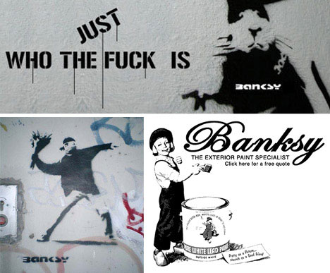
While he has subsequently become known for all kinds of installation art and other culture jamming projects Banksy has his roots in traditional graffiti, stencils and drawings. Much of his earliest – and now most valuable – work can be found scrawled in notebooks or on public walls around Great Britain. Extensive use of stencils in particular has helped Banksy work more quickly and maintain his anonymity.


Research Banksy's work to attempt to answer this question.
What are some of the differing opinions about Banksy's work?


He is an anti-consumer so he doesn't like advertisements in public places so he doesn't open exhibitions or own the gallery unlike other artist.
We can see a bitter satire on society in his works. I really agree his opinion.


How does his work sit in relation to consumerism? Can his work be sold?
What are some of his attitudes to the sale of Art?


He is an anti-consumer so he doesn't like advertisements in public places so he doesn't open exhibitions or own the gallery. He express his works in public areas without any interests. Then can we buy his works? Yes, we can because the reasons at the front that I mentioned that he doesn't like public advertisements so Even though he sells his work through auction, which is call ebay he doesn't sell his work by using advertisements and gallery or exhibitions. Therefore only some people who really want to buy banksy's work can get his works.

I can know this facts after i found some informations such as news on internet like this.

http://kateschildwaster.com/2009/02/21/banksy-the-anti-consumer/

“You owe the companies nothing. Less than nothing, you especially don’t owe them any courtesy. They owe you. They have re-arranged the world to put themselves in front of you. They never asked for your permission, don’t even start asking for theirs.” -Banksy

Banksy, who puts much effort into remaining anonymous, is the ultimate anti-consumer and king of satirical artistry. His work is ingenious. And as anonymous as he is, his art spans the public area. Even though I want to end up as that person rearranging the world to put her company in front of the consumer, I still have the utmost respect for Banksy and what he stands for. Obviously, after first learning about this pseudo-anonymous artist, I had to check out his website, and I immediately fell in love with his work and how he presents it. Yes, it’s his portfolio, but what’s more- it is his way of getting his message to the masses, even if it is painted over. He has a section of photos on his website, “What happened next” that shows the progression of a few of his paintings that public authorities altered in order to remove the negative messages they portrayed. But Banksy’s work screams the truth, and although it is often covered and quickly hidden, it definitely has an impact on those who see it.

Something that caught my interest when browsing through the artwork in the “Outdoors” section on Banksy’s site was an article he had posted that criticized one of his graffiti images. The author goes into detail about how the sniper in the picture is holding the rifle completely backwards, and insults Banksy, labeling him as less than an amateur. I found this article entirely amusing. Did the artist or the ex-servicemen fail to notice the child behind the sniper who is about to scare him by bursting a paper bag? Wouldn’t they think there was a little more to this artwork and taking it literally was the last thing they should do? Maybe the whole point of this painting is to portray that the sniper is unaware and incapable. Surely, if Banksy were to copy a picture from a photograph he would get it right. Looking at some of his crude oil works, anyone can notice his attention to detail in his detournement of paintings by famous artists such as Monet and Gainsborough. If a sniper had already allowed a young child to sneak up behind him, then it is only fitting he be absurdly “holding a rifle into his right shoulder and steadying the weapon with his right hand, while using his left hand to pull the trigger.” It is a mistake only a professional serviceman would notice, but based on Banksy’s work I want to believe it was not done in error. Then again, maybe I am giving the man too much credit. Because his graffiti is so widely publicized, it undergoes much review and interpretation that Banksy may not have originally intended. This is a man who once said, “I’d been painting rats for three years before someone said ‘that’s clever, it’s an anagram of art’ and I had to pretend I’d known that all along.” He loves art, sees things in the world he doesn’t like, and uses his art to express that. His graffiti, he claims, is painted in 35 seconds at times, so if every little detail is not perfect, I think we could let it slide. After all, how much time can a graffiti artist spend on little insignificant details when he’s constantly worried about staying under the radar?

Added to my wish list of books: Banging your head against a brick wall by Banksy

http://www.dailymail.co.uk/news/article-508290/Wall-painted-Banksy-sells-200-000--new-owner-fork-brick-canvas.html

"Wall painted by Banksy sells for £200,000 - but the new owner must also fork out to move the brick canvas"

An online bidder has paid £200,000 for a wall painted by graffiti artist Banksy.
The stencilled design of a classically-dressed painter putting the finishing touches to the real artist's scrawled name attracted 69 bids on eBay, finally achieving a top bid of £208,100.
But the successful bidder also faces the challenge - and the cost - of removing the brick canvas from its west London home.
The work appeared outside a post-production company run by Luti Fagbenle on Portobello Road last September.
After deciding to auction the wall, the potential seller protected the investment against vandals with a plastic sheet.
A spokesman for Banksy said the work was authentic but added that the artist would not comment on the sale.
Works by Banksy, who is originally from Bristol, have grown in popularity in recent years.
Fans and buyers include Christina Aguilera, Brad Pitt and Angelina Jolie. He recently extended his canvases of choice - Bristol and east London - to include the illegal security wall in the occupied Palestinian territories.
Last year, one of his paintings, Space Girl And Bird, fetched £288,000 at auction.
Bobby Read, art expert at specialist insurer Hiscox, said: "Banksy is a maverick as well as a hugely talented artist. It's an intoxicating combination for buyers as this price shows.
"The Portobello Road wall is a special piece and probably the largest piece of Banksy art work to have been sold at a public auction.
"This sale poses many interesting questions for the art world. How do you move a piece of work like this, how do you display it and how do you insure it?"

Who is Banksy? Do we know his true identity?


Banksy is a pseudonymous British graffiti artist. He is believed to be a native of Yate, South Gloucestershire, near Bristol and to have been born in 1974,but his identity is unknown.According to Tristan Manco,[who?] Banksy "was born in 1974 and raised in Bristol, England. The son of a photocopier technician, he trained as a butcher but became involved in graffiti during the great Bristol aerosol boom of the late 1980s." His artworks are often satirical pieces of art on topics such as politics, culture, and ethics. His street art, which combines graffiti writing with a distinctive stencilling technique, is similar to Blek le Rat, who began to work with stencils in 1981 in Paris and members of the anarcho-punk band Crass who maintained a graffiti stencil campaign on the London Tube System in the late 1970s and early 1980s. His art has appeared in cities around the world. Banksy's work was born out of the Bristol underground scene which involved collaborations between artists and musicians.

Banksy does not sell photos of street graffiti.Art auctioneers have been known to attempt to sell his street art on location and leave the problem of its removal in the hands of the winning bidder.

Banksy's first film, Exit Through The Gift Shop, billed as "the world's first street art disaster movie", made its debut at the 2010 Sundance Film Festival.The film was released in the UK on March 5.

The 10-year quest to discover the true identity of the underground artist known as Banksy has become almost as captivating as his stylised graffiti which has popped up unannounced on buildings across the world.

While many have claimed to know who he is, the only reliable facts are that he hails from Bristol and his first name is Robin. Now the mystery surrounding the identity of Banksy may have been solved by a newspaper which has published a picture of a man whose antecedence is more public school than street artist.

The Mail On Sunday says it traced the artist using a photograph purporting to show Banksy at work with spray cans in Jamaica in 2004. Former friends and acquaintances identify the man in the picture as Robin Gunningham, a former pupil of the £9,420-a-year Bristol Cathedral School.

Related articles
You dirty rat: street cleaners prepare to blast Banksy away
Staying anonymous is 'crippling', says Banksy
Move over, Banksy: Meet the next generation of artists coming up from the street
Search the news archive for more stories
Since his emergence as a leading street artist, Banksy's work attracts six-figure price tags. In January a piece of his edgy graffiti in Portobello Road, west London – which shows a painter finishing off the word "Banksy" – received a bid of £208,100 in an online auction.

Yesterday the artist's agents refused to confirm the newspaper's claim that he was Mr Gunningham, 34, despite what the paper said was compelling evidence to support its assertion. "We get these calls all the time," said his spokeswoman. "I'll say what I always say: I never confirm or deny these stories."

The subversive political messages Banksy conveys through his stencils and sculptures can be found on streets, walls and buildings across the world, from London to New York.

Last year, he left a life-size replica of a Guantanamo Bay detainee at the California theme park Disneyland. And in 2005, he decorated Israel's West Bank barrier with satirical images of life on the other side.

He has become one of art's hottest properties, with Angelina Jolie and Christina Aguilera among those said to have splashed out on his work.

One of the first conventional exhibitions of his art was held in a warehouse in 2000, but Banksy gave out only the street number for the building and not the street. As mainstream interest began to grow, he concocted elaborate deceptions to shroud his identity, usually conducting interviews via telephone and using trusted associates to handle sales.

With the increased publicity, however, came greater danger of being caught spray painting on public sites, and so Banksy began to undertake more elaborate, one-off stunts. He got into the penguin exhibit at the London Zoo and stencilled "We're bored of fish" on the wall; in October 2003 he hung one of his own paintings on the wall of the Tate. It depicted a bucolic country scene bounded by police tape and the identification tag below it read: "Banksy 1975. Crimewatch UK Has Ruined The Countryside For All Of Us. 2003. Oil On Canvas." He pulled a similar stunt in 2005 at four major museums in New York City, including the Museum of Modern Art, which decided to add the piece to its permanent collection.

When he gives interviews, Banksy insists the public should never discover who he is. "I have no interest in ever coming out," he told Swindle magazine. "I'm just trying to make the pictures look good; I'm not into trying to make myself look good. And besides, it's a pretty safe bet that the reality of me would be a crushing disappointment to a couple of 15-year-old

http://www.independent.co.uk/arts-entertainment/art/news/has-banksys-real-identity-been-discovered-at-last-866867.html


We can see a bitter satire on society in his works.

Monday, 24 May 2010

Industrialisation and Art- week 7

1.Define the Industrial Revolution and Industrialism.

I think Industrial Revolution is a change of economy and society structures by technical innovation in the eighteenth century all of western Europe.

The industrial Revolution may be defined as the application of power-driven machinery to manufacturing. It had its beginning in remote times, and is still continuing in some places. In the eighteenth century all of western Europe began to industrialize rapidly, but in England the process was most highly accelerated. England's head start may be attributed to the emergence of a number of simulataneous factors.


2.Research Monet's painting 'Impression Sunrise'(1873) to analyze the work in relation to Industrialisation.

'Impression Sunrise' (1873)


Monet drawed this picture with impression while he saw Le havre port at home. This is why this work's name is 'Impression Sunrise'. We can see simple expression in this and basis of impressionism which do not use black. It is innovative experiment that we can draw darkness without black so some people who belive that night is black criticize Monet's scientific persuation which is light problem. Monet wanted to give us impression with light and shadow. I think...That can belong to in relation to factors of Industrialisation such as Technological change since 1700 and Electric Power.

( in Resource book p116)
Electric Power is that it was not until 1873 that a dynamo capable of prolonged operation was developed, but as early as 1831 Michael Faraday demonstrated how electricity could be mechanically produced. Through the nineteenth century the sue of electric power was limited by small productive capacity, short transmission lines, and high cost. Up to 1900 the only cheap electricity was that produced by generators making use of falling water in the mountains of southeastern France and northern Italy. Italy, without coal resources, soon had electricity in every village north of Rome. Electric current ran Italian textile looms and, eventually, automobile factories. As early as 1890 Florence boasted the world's first electric streetcar.

The electrification of Europe proceeded apace in the twentieth century. Russia harnessed the Dneiper River and the Irish Free State built power plants no the River Shannon. Germany was supplied with electricity in the 1920's, and by 1936 Great Britain had built and "electric grid" completely covering the country. Electrecity was a major factor in the phenomenally rapid industrialization of Russia in the 1930's.

3.Olafur Eliasson's 'Weather Project'(2006) is a contemporary work that relates to Monet's famous landscape.


-http://www.tate.org.uk/modern/exhibitions/eliasson/about.htm

The subject of the weather has long shaped the content of everyday conversation. The eighteenth-century writer Samuel Johnson famously remarked ‘It is commonly observed, that when two Englishmen meet, their first talk is of the weather; they are in haste to tell each other, what each must already know, that it is hot or cold, bright or cloudy, windy or calm.’ In The Weather Project, the fourth in the annual Unilever Series of commissions for the Turbine Hall, Olafur Eliasson takes this ubiquitous subject as the basis for exploring ideas about experience, mediation and representation.

In this installation, The Weather Project, representations of the sun and sky dominate the expanse of the Turbine Hall. A fine mist permeates the space, as if creeping in from the environment outside. Throughout the day, the mist accumulates into faint, cloud-like formations, before dissipating across the space. A glance overhead, to see where the mist might escape, reveals that the ceiling of the Turbine Hall has disappeared, replaced by a reflection of the space below. At the far end of the hall is a giant semi-circular form made up of hundreds of mono-frequency lamps. The arc repeated in the mirror overhead produces a sphere of dazzling radiance linking the real space with the reflection. Generally used in street lighting, mono-frequency lamps emit light at such a narrow frequency that colours other than yellow and black are invisible, thus transforming the visual field around the sun into a vast duotone landscape.